Introduction
ArcGIS Pro will be used through an online tutorial through
Esri and I will be calculating impervious surface area. This tutorial will
allow me to classify an aerial image to determine surface types.
Methods
Lesson 1. Segment the
Imagery
First, download the data into the designated folder for
saving purposes and open an aerial image into ArcGIS Pro. This map is a
neighborhood near Louisville, Kentucky and has 6-inch resolution, and is a
4-band aerial photograph. Next you will open up the tasks folder under the
project pane in order to get the steps on how to calculate surface imperviousness
(figure 1).

Figure 1. Project pane showing where to open up the tasks window
Next to do is extracting the spectral bands while setting
specific parameters to create a new image with only three bands. Then I clicked
create new layer down at the bottom and a layer with three bands extracted is
shown on the map (figure 2).

Figure 2. Extracted spectral bands of the new layer
Next is segmenting the image where you’ll group similar pixels
into segments. First I clicked the segment mean shift raster function and input
all the correct parameters and once again click create new layer. This will
enable the image to be simplified and classify broad land-use types more accurately
(figure 3).
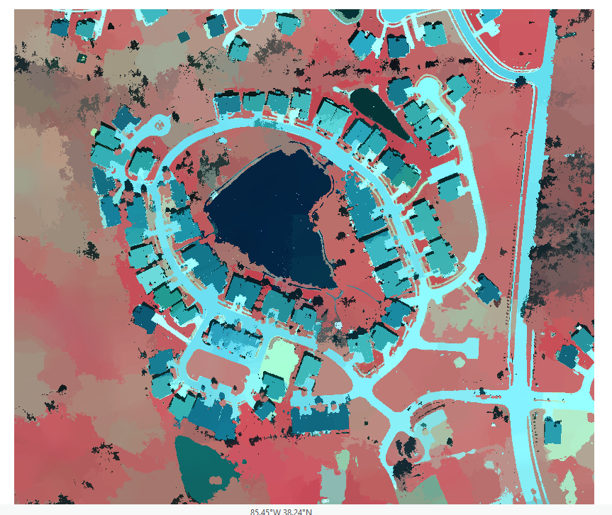
Figure 3. Segmented image where it has been simplified
Lesson 2. Classify
the Imagery
Right away I cannot create the training samples in ArcGIS
Pro so ArcMap must be opened and the training samples are exported to a shape
file of your desire. First connect to the desired folder in ArcMap and turn on
Image Classification toolbar to create training samples. Bring into ArcMap the
Louisville Segmented and Louisville Neighborhood images and makes sure the
Louisville Segmented is in the Image Classification Layer. Next select the
Training Sample Manager to open up the window as shown in figure 4.

Figure 4. Training Sample Manager window
Next I created seven classes of types of land use in the
image by merging multiple colors of the same class into one. These classes
consisted on Gray Roofs, Roads, Driveways, Bare Earth, Grass, Water, and
Shadows (figure 5). Once the seven classes were finished, I saved the training
samples as a shapefile into my designated folder.

Figure 5. Classifying each type of land use (Gray Roofs was the first class)
Next I went back to ArcGIS Pro and opened up the train the
classifier task. The parameters window opens up and you input the raster and
training sample file while saving it to the correct place (figure 6). Once the
parameters are all correct, click finish and go on to classifying the imagery.

Figure 6. Train the Classifier parameters window
Go to Classify the Imagery in the tasks pane and input the
parameters. After the parameters are set, run the tool and a map with those
color classes are created. Next you change the value of the fields by inputting
0 for gray roofs, driveways, and roads while bare earth, grass, shadows, and
water are set to 1 (figure 7).

Figure 7. Value of the fields are changed to 0 (impervious) and 1 (pervious)
Lesson 3. Calculate
Impervious Surface Area
In this last lesson, an accuracy assessment on the
classification to determine if it is within an acceptable range of error will
be performed. After that includes calculating the area of impervious surfaces
per land parcel so the local government can assign storm water fees.
First, create accuracy assessment points by going under the
tasks pane and selecting the correct inputs and click run. After its run, open
up the attribute table in the contents pane under My Accuracy Points. This shows
all of the fields that the points have on the map (figure 8). Then for the
first ten accuracy points you’ll change the GrndTrth to either a 0 or 1, whatever
the class it falls into on the map. After that is finished, Click run, Save
edits, and Finish the task.

Figure 8. Table of My Accuracy Points
Next is compute a confusion matrix using the points from
before. Again you’ll click the task of
Compute Confusion Matrix, input the parameters, and Finish the task. This shows
the ability to give an estimate on how accurate the data truly is (figure 9).

Figure 9. Table which shows the accuracy of the point data
After that is completed close the table and open the
Tabulate the Area task. Input the correct parameters and run the tool. Once the
new table is created, a table join with parameters must be filled out as well
in order to join the tables together. Once the parameters are entered, hit
Finish and the tools run and the task ends.
Lastly, the parcels need to be symbolized by impervious surface
area to depict the area attribute on the map. First, Click the Clean up the
table and symbolize the data task and select the Parcels layer, then click run.
Edit the names in the correct rows and columns as shown in figure 10.

Figure 10. Parcel layer attribute table that has been edited
Following the edits, Run the Parcels layer by making sure it
is checked and highlighted in the Contents tab before running. Then set the
correct parameters in the symbology tab to the right side of the project. The
symbology of the map shows that the highest area of impervious surfaces appear
to red and the low area of impervious surfaces appear to be yellow (figure 11).

Figure 11. Symbology map of the most impervious parcels to the least impervious parcels
Conclusions
In this lab I classified an aerial image of a neighborhood
to show areas that were pervious and impervious to water. Then I assessed the
accuracy of my classification and determined the area of impervious surfaces
per land parcel.
No comments:
Post a Comment