Monday, March 13, 2017

Adding GCP's to Pix4D

Introduction

In Pix4D software, ground control points (GCP’s) are used to align the image with the surface of the earth so that your resultant products are spatially and geographically accurate. GCP’s are first collected out in the field from a GPS system with images that have specific coordinates tied to them. The reason we use GCP’s in Pix4D software is to enhance the spatial context of the data, allowing the final products to be more geometrically accurate than the raw data collected with the GPS system.

Methods
In this lab GCP’s have already been obtained from the field and imported onto the computer so that they can be used on the images provided from the Litchfield flight logs. Therefor moving tying down the GCP’s in Pix4D is what will be discussed in the section below. Since last week was getting familiar with Pix4D and how to process images, we will now use GCP’s to further enhance the accuracy of the images, process those enhanced images, and have a more geospatially correct final product.

First, when opening up Pix4D, name the project with the specified characteristics of the project. Then create a workspace in which you can keep all your data saved in as shown in figure 1. On the next page, add the images of the flight you want and make sure the “Shutter Model” is set to Linear Rolling Shutter.

Figure 1. Showing the new project window with the name and desired workspace

Next step is to import GCP’s by clicking on the “Import GCP's…” in the GCP/MTP Manager. When adding GCP’s you have to make sure your latitude and longitude numbers are correct. Y corresponds with latitude, and X corresponds with longitude (figure 2). If the latitude and longitude numbers are reversed, your data will be thrown way off and the images will not line up spatially correct. If it’s correct, the GCP’s will show up in your flight area.

Figure 2. GCP/MTP Manager window with the Import GCP coordinate window popped up.

After all the information is correct and GCP’s are imported, run the initial processing because tying the GCP’s to the imagery is way easier and more efficient in rayCloud rather than doing it manually. Make sure you uncheck steps 2 and 3, then you can press start to run the initial processing (figure 3).
Once the initial processing is finished, go into rayCloud editor and click on a GCP point to bring up the images where that GCP is located. Find the GCP within the image and click on the center to tie the image down to the GCP (figure 4). For each GCP, use 2 to 3 points in order to tie down the image. Once the GCP’s are tied down, go to “automatic marking” and “apply.” Next, go under “Process” and select, rematch and optimize.

Figure 3. Showing where to check step 1, uncheck steps 2 and 3.

Figure 4. Picture showing where the images are tied down to the GCP's in rayCloud.

Since there are two sets of data that need to be put together, the merge project selection must occur at the first window instead of selecting new project. This allows the processing of each dataset to happen faster. After the projects have been merged, the finished product can be used in ArcMap to make maps.
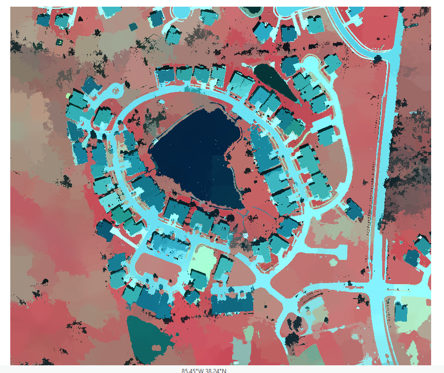
Results

The new DSM can now be brought into ArcMap in order to view all of the data and to create various maps. The map I have created below in figure 5 is an elevation map of Litchfield that also shows all of the ground control points (GCP). Since these GCP’s have been added, this new map is more accurate than the map created in the first Pix4D lab.

Figure 5. Map created from Pix4D Litchfield Flights 1 and 2 data.


Conclusion


Collecting GCP’s and using them as tie down points with the imagery can greatly increase the accuracy of your maps. This is a great way to ensure the accuracy with UAS platforms and collect more accurate data such as volumes within the Pix4D software. Merging two projects also is great to create a larger connected map that’s within the same location.  

Sunday, March 5, 2017

Value Added Data Analysis with ArcGIS Pro

Introduction

ArcGIS Pro will be used through an online tutorial through Esri and I will be calculating impervious surface area. This tutorial will allow me to classify an aerial image to determine surface types.

Methods

Lesson 1. Segment the Imagery

First, download the data into the designated folder for saving purposes and open an aerial image into ArcGIS Pro. This map is a neighborhood near Louisville, Kentucky and has 6-inch resolution, and is a 4-band aerial photograph. Next you will open up the tasks folder under the project pane in order to get the steps on how to calculate surface imperviousness (figure 1).
 Figure 1. Project pane showing where to open up the tasks window

Next to do is extracting the spectral bands while setting specific parameters to create a new image with only three bands. Then I clicked create new layer down at the bottom and a layer with three bands extracted is shown on the map (figure 2).
Figure 2. Extracted spectral bands of the new layer

Next is segmenting the image where you’ll group similar pixels into segments. First I clicked the segment mean shift raster function and input all the correct parameters and once again click create new layer. This will enable the image to be simplified and classify broad land-use types more accurately (figure 3).
Figure 3. Segmented image where it has been simplified


Lesson 2. Classify the Imagery

Right away I cannot create the training samples in ArcGIS Pro so ArcMap must be opened and the training samples are exported to a shape file of your desire. First connect to the desired folder in ArcMap and turn on Image Classification toolbar to create training samples. Bring into ArcMap the Louisville Segmented and Louisville Neighborhood images and makes sure the Louisville Segmented is in the Image Classification Layer. Next select the Training Sample Manager to open up the window as shown in figure 4.
Figure 4. Training Sample Manager window

Next I created seven classes of types of land use in the image by merging multiple colors of the same class into one. These classes consisted on Gray Roofs, Roads, Driveways, Bare Earth, Grass, Water, and Shadows (figure 5). Once the seven classes were finished, I saved the training samples as a shapefile into my designated folder.
Figure 5. Classifying each type of land use (Gray Roofs was the first class)

Next I went back to ArcGIS Pro and opened up the train the classifier task. The parameters window opens up and you input the raster and training sample file while saving it to the correct place (figure 6). Once the parameters are all correct, click finish and go on to classifying the imagery.
Figure 6. Train the Classifier parameters window

Go to Classify the Imagery in the tasks pane and input the parameters. After the parameters are set, run the tool and a map with those color classes are created. Next you change the value of the fields by inputting 0 for gray roofs, driveways, and roads while bare earth, grass, shadows, and water are set to 1 (figure 7).

Figure 7. Value of the fields are changed to 0 (impervious) and 1 (pervious)


Lesson 3. Calculate Impervious Surface Area

In this last lesson, an accuracy assessment on the classification to determine if it is within an acceptable range of error will be performed. After that includes calculating the area of impervious surfaces per land parcel so the local government can assign storm water fees.

First, create accuracy assessment points by going under the tasks pane and selecting the correct inputs and click run. After its run, open up the attribute table in the contents pane under My Accuracy Points. This shows all of the fields that the points have on the map (figure 8). Then for the first ten accuracy points you’ll change the GrndTrth to either a 0 or 1, whatever the class it falls into on the map. After that is finished, Click run, Save edits, and Finish the task.
Figure 8. Table of My Accuracy Points

Next is compute a confusion matrix using the points from before.  Again you’ll click the task of Compute Confusion Matrix, input the parameters, and Finish the task. This shows the ability to give an estimate on how accurate the data truly is (figure 9).
Figure 9. Table which shows the accuracy of the point data

After that is completed close the table and open the Tabulate the Area task. Input the correct parameters and run the tool. Once the new table is created, a table join with parameters must be filled out as well in order to join the tables together. Once the parameters are entered, hit Finish and the tools run and the task ends.

Lastly, the parcels need to be symbolized by impervious surface area to depict the area attribute on the map. First, Click the Clean up the table and symbolize the data task and select the Parcels layer, then click run. Edit the names in the correct rows and columns as shown in figure 10.  
Figure 10. Parcel layer attribute table that has been edited

Following the edits, Run the Parcels layer by making sure it is checked and highlighted in the Contents tab before running. Then set the correct parameters in the symbology tab to the right side of the project. The symbology of the map shows that the highest area of impervious surfaces appear to red and the low area of impervious surfaces appear to be yellow (figure 11).

Figure 11. Symbology map of the most impervious parcels to the least impervious parcels


Conclusions


In this lab I classified an aerial image of a neighborhood to show areas that were pervious and impervious to water. Then I assessed the accuracy of my classification and determined the area of impervious surfaces per land parcel.

Processing Pix4D Imagery

Introduction

Pix4D software is used for constructing point clouds that can be turned into orthomosaic images obtained from UAS platforms. This software has numerous applications including agriculture, mining, emergency response, and various others.

Part 1: Get familiar with the product

What is the overlap needed for Pix4D to process imagery?
The recommended overlap for most cases is at least 75% frontal overlap (with respect to the flight direction) and at least 60% side overlap (between flying tracks). It is recommended to take the images with a regular grid pattern shown in figure 1. The camera should be maintained as much possible at a constant height over the object.
Figure 1. Grid pattern of UAS platform taking aerial pictures

What if the user is flying over sand/snow, or uniform fields?
If there is complex geometry or large uniform areas within the overlapping images, it is much more difficult to extract common characteristic points. In order to get good results the overlap between images should be increased to at least 85% frontal overlap and at least 70% side overlap. Also increasing the altitude will provide less perspective distortion and better visual properties.

What is Rapid Check?
Rapid Check is a processing system where accuracy is traded for speed since it is mostly used in the field while obtaining data. It processes faster in an effort to quickly determine whether sufficient coverage was obtained, but the result has low accuracy.

Can Pix4D process multiple flights? What does the pilot need to maintain if so?
Pix4D is able to process images from multiple flights but in order to maintain that the pilot needs to make sure each 1) plan captures the images with enough overlap, 2) that enough overlap between two image acquisition plans (figure 2), and 3) that different plans are taken as much as possible under the same conditions such as weather, time of day, altitude etc.
Figure 2. UAS grid pattern route with enough overlap to process images

Can Pix4D process oblique images? What type of data do you need if so?
Pix4D can process oblique images but it will not create a complete orthomosaic. For this type of data you would need multiple flights with images taken at angles between 10 and 35 degrees. The images should have plenty of overlap in each data set but it is strongly recommended to use GCP’s or Manual Tie Points to properly adjust the images.

Are GCPs necessary for Pix4D? When are they highly recommended?
Ground Control Points are not necessary for Pix4D but the accuracy of the data is dramatically increased when they are used. GCP’s are highly recommended for high precision data and using oblique and nadir images together such as city reconstruction.

What is the quality report?
The quality report is the final report that is automatically displayed after you have processed your data. It gives information on the images, dataset, camera optimization, matching, georeferencing, and other information about the data.

Part 2: Using the Software

In class professor Hupy went through the steps necessary to create a Pix4D project. A PowerPoint was also used to help explain the steps taken throughout.

After the flights have been made and all the data is downloaded onto your computer, open up Pix4D and select Project>New project from the menu bar to open up a New Project window (figure 3). Within this window you must create a name using the date, site, platform, and altitude. Also select a location to save the project in.
Figure 3. New Project window

Click Next and continue with selecting all of the images you want to process and create the point cloud with. Simply select the images out of the folder and import them (figure 4). Then edit the camera model by selecting the “Edit” button under “Selected Camera Model.” Here a new window is displayed and changing the camera properties to Linear Rolling Shutter is done so by clicking “Edit” under “Camera Model Name” and changing the “Shutter Model” to Linear Rolling Shutter (figure 5).

Figure 4. Select the images for processing
Figure 5. Edit Camera Model window and changing Shutter Model to "Linear Rolling Shutter"

Select Next and continue to the Processing Options Template. As shown in figure 6, you can select what type of project you want the software to develop. Here I will be creating a 3D map from the images so the 3D Map option is selected.
Figure 6. Selecting a Processing Options Template, in this case 3D Maps

The last step before processing the data is selecting the desired coordinate system for the project to be displayed (figure 7). In this case the desired coordinate system was already selected so I went ahead and clicked finish to create the project.
Figure 7. Select a desired Output Coordinate System

After clicking Finish, a map view screen appears showing the overall layout of the flight. Right away go to processing steps 2 and 3 and uncheck those, then click on processing options in the lower left corner (figure 8). Press start and go practice on the flight simulator to buy some time because it does take a while to process.
Figure 8. In the lower left corner of the screen, uncheck steps 2 and 3 then click start

Once it is done processing a quality report will provide information on the quality of data accuracy and collection that has been taken (figure 9). The report looks good if all the steps are green and no red errors appear.
Figure 9. Quality Report table 

Next go to RayCloud and turn off cameras and turn on the triangle mesh to view the model (figure 10).
Figure 10. In rayCloud, uncheck the cameras and turn on the triangle mesh located in the contents area

In the dataset 68 of the 68 images (100%) were calibrated and all of the images were enabled. Figure 11 displays the number of overlapping images computed for each pixel of the orthomosaic. The red and yellow areas indicate low overlap with poor results and the green areas indicate an overlap of over 5 images with good quality.
Figure 11. Overlapping images with green having high overlaps and red with low overlaps

Next I measured the volume of one of the piles within the area of interest. First, I clicked on Volumes, then I digitized around the base of the pile and when the last vertex was put in, Right-click and finish the sketch. Then click compute and it gives data for Terrain 3D area, Cut Volume, Fill Volume, and Total Volume as shown in figure 12.
Figure 12. Area of Interest where volume was calculated

The last feature I used in Pix4D was the “fly through animation video.” In order to create this video, click on rayCloud, and go to New Video Animation that is located towards the top. From there I drew out how many timestamps I wanted to create and what direction the video focused on. After the video was created select a folder to save to and select Render. A video has been added below to show the 3D area of Litchfield.


Part 3: Maps

Map 1. Orthomosaic of Litchfield underlain by World Imagery Basemap and with the "No Data" removed


Map 2. DSM of Litchfield with the elevations of the site, red is higher elevations while green is lower elevations


Monday, February 27, 2017

Overview of Sand Mining in Western Wisconsin

Introduction
Frac sand mining in western Wisconsin has been occurring for more than 100 years. This non-metallic resource is very abundant in Wisconsin and has suitable characteristics to be used for glass manufacture, golf courses, and more recently to obtain petroleum products by hydraulic fracturing. Frac sand is quartz that has specific qualities such as grain size, rounded, well sorted, and withstands high pressures.  After the frac sand is taken out of the ground, it is washed, sorted using some sort of sieve process, and dried to be shipped elsewhere. Most of the frac sand mining facilities today are located near railroads and major highways because there is so much abundance. Shown below in figure 1 are the locations of sand mines found in Wisconsin along with the sandstone formations outline in the state (Wisconsin Geological and Natural History Survey, 2012).
Figure 1. Locations of sand mines in Wisconsin as of 2012 (Wisconsin Geological and Natural History Survey, 2012).


Much of the desired qualities for frac sand mining discussed above lie in certain formations in western Wisconsin. The formations that contain this frac sand include the Wonewoc, Jordan, and the St. Peter sandstone formations. These formations were formed during the Cambrian and Ordivician when shallow marine seas had covered western Wisconsin. Figure 2 shows a geologic map of the Midwest with the Cambrians Wonewoc and Jordan formations in red and the Ordovician St. peter sandstone in yellow (USGS Geologic map of North America Adapted from the map by J.C. Reed, Jr. and others 2005).
Figure 2. Location of the 3 main types of formations used to extract frac sand (USGS Geologic map of North America Adapted from the map by J.C. Reed, Jr. and others 2005).


Issues with frac sand mining in western Wisconsin

With the development of frac sand mines there are also problems that must be dealt with to proceed with the removal of the non-metallic resource. First, the companies must get permits from the city and state governments to allow the mining to continue. There are always concerns when it comes to the environmental aspect of mining.  This includes air emissions that are released during extraction, blasting, crushing, processing, and transportation of frac sand. Another issue that needs to be looked at after the mine is finished or used up the resource, they must think about reclamation processes required by the DNR. The DNR can however provide assistance to help create a good reclamation plan in order to create a more sustainable area.


GIS usage for further exploration

During this semester, my skills in GIS will be put to the test while I try to solve problems and the way in which I solve them with the frac sand industry. I will be using my skills to analyze data that I can acquire through various sources to better understand some of the environmental hazards created during frac sand mining. In this case, western Wisconsin will be my area of interest for frac sand mining and its environmental hazards.

Sources:
National Center for Freight and Infrastructure Research and Education. 2013. Transportation Impacts of Frac Sand Mining in the MAFC Region: Chippewa County Case Study. Retrieved February 27, 2017.
http://midamericafreight.org/wp-content/uploads/FracSandWhitePaperDRAFT.pdf

USGS. (2012). Frac sand in WI. Retrieved February 27, 2017.

WDNR. 2016 (last revised). Industrial Sand Mining Overview. Retrieved February 27, 2017.
http://dnr.wi.gov/topic/Mines/Sand.html

WDNR. 2012. Silica sand mining in Wisconsin. Retrieved February 27, 2017.

Monday, February 20, 2017

Constructing maps using Pix4D

Introduction

Why are proper cartographic skills essential in working with UAS data?

Without context in an aerial image, it’s difficult to process what exactly you are looking at and what you are trying to recover from the image itself. Even when adding a North arrow and scale, the UAS data within the map becomes more useful.

What are the fundamentals of turning either a drawing or an aerial image into a map?

First, a reference scale should be added in order to get an idea of how big the area you are looking at is. A north arrow should also be added to have a sense of direction. A locator map can also help with a broader context of the area of interest.

What can spatial patterns of data tell the reader about UAS data? Provide several examples.

Spatial patterns of data can tell the reader about possible future exploration or a decrease in crop yield. Some examples include using certain sensors to detect economic mineral deposits similar to using geomagnetic surveys. Another example may include obtaining the soil moisture content in a farm field to increase the farmers yield.

What are the objectives of the lab?

The objective in this lab is to learn how to create good maps with UAS data within GIS software to further analyze and use the data. This lab also includes learning the difference between DSM and DEM, and how to create a map from an aerial image using fundamental map-making processes.

Methods

First off, opening up the DSM and Orthomosaic into ArcMap is necessary so they can be used to create the final elevation map. After the DSM and orthomosaic are brought in, use the hillshade tool by searching “hillshade tool” and apply it to the DSM. Finally, create the map with the fundamentals of a map-making such as including the north arrow, scale, legend, etc.


Figure 1. DSM and Orthomosaic of a sports-field in western Wisconsin showing elevation

What is the difference between a DSM and DEM? The difference between a Georeferenced Mosaic and an Orthorectified Mosaic?

The difference between a DSM and a DEM is that the DSM is a Digital Surface Map while a DEM is a Digital Elevation Map. A DSM has numerous values included for the elevation while A DEM only has the ground surface to create the raster. A georeferenced mosaic takes an image with an already known coordinate system using ground control points to secure the image while an orthorectified mosaic takes an image and accurately adjust it by stitching together tie points using the computer so the image has a known coordinate system. 

What are those statistics? Why use them? 

The statistics for the DSM are important because it shows all of the data used for presenting on a map such as the values of minimum and maximum ground elevation.

Metadata:
Platform: DJI Phantom 3 Advanced
Drone Sensor: Sony 16 Megapixel Camera
Altitude: 60 meters
Coordinate System: WGS1984 UTM zone 15N
Projection: WI State Plain
Date: March 7, 2016

Results

What types of patterns do you notice on the orthomosaic?

On the orthomosaic there is a noticeable gradual slope increase from southwest to northeast. There is also a straight line of trees on the west side of the map that run north and south.

What patterns are noted on the DSM? How do these patterns align with the DSM descriptive statistics? How do the DSM patterns align with patterns with the orthomosaic?

On the DSM, there is a line pattern that resembles what would be the elevation on the map. These patterns on the DSM align with the statistics that have shown the values in elevation. Other patterns that line up with the orthomosaic are the trees, building, and other vegetation.

Describe the regions you created by combining differences in topography and vegetation.

The regions included a topographical high and low based on the higher elevation in the north, and the lower elevation in the south. The vegetation is separated into two so that it would not be a problem for everything else in the map.

What anomalies or errors are noted in the data sets?

In these data sets, there are no ground control points to stitch the parts down to the basemap. Other errors or anomalies include variable elevation numbers that could be off due to the trees reaching higher up and how the image was taken.

Where is the data quality the best? Where do you note poor data quality? How might this relate to the application?

The best data quality is towards the middle of the image because this is the area where its being stitched together. The poor data quality lies in the upper left corner of the image but could most likely be resolved by obtaining more data from that area.

Conclusion

Summarize what makes UAS data useful as a tool to the cartographer and GIS user?

UAS data is very useful when it comes to high quality data and solving problems for the cartographer and GIS user. It can display high levels of accuracy in a short amount of time.

 What limitations does the data have? What should the user know about the data when working with it?

The downfalls are that in order to obtain this data, there must be good weather with low wind speed in the environment you are working in. Also when the user is working with the data, the program may not have the correct values when it is processed.

Speculate what other forms of data this data could be combined with to make it even more useful.

Another form of data that this could be combined with is ground control points so that the data can be stitched and tied down even better than if it was only the platform.

Monday, February 6, 2017

UAS Platform Consulting Report

Introduction:

When employers first start getting involved with UAS technology and the software programs that go along with the systems, they will want to know what the most efficient yet reasonably priced drones are. The process of finding an exceptional UAS platform at a satisfactory price can be lengthy and grueling. First you must know what the project or what type of industry the project is in so that the correct drone can be purchased to get the job done. For example, an agricultural drone with specific software programs may be different than purchasing a drone for mapping and surveying. Shown below are the three different categories that are based on prices, with the hobby/low level commercial (cheapest), mid-level commercial, and high-level commercial (most expensive).

Low Level Commercial/ Hobby UAS Platform:

UAS platforms that mostly pertain to hobby or low level commercial use includes spending anywhere from $500-$5,000 on a single platform. One of the top of the line UAS platforms for hobby or low level commercial flying includes the DJI Phantom 4 pro. Depending on the package you want to include with the DJI Phantom 4 pro, the price can range from roughly $2,000 with 32 GB micro-SD card to $2,700 with a 64 GB micro-SD and various other accessories for the platform.
The DJI Phantom 4 pro is a multirotor drone with 4 propellers. The dimensions of this platform are basic specifications include a 30-minute maximum flight time with a range of up to 4.3 miles (7 km). The battery is the same as the Phantom 4 but the newer technology also gives you a longer recording time on your camera. It weighs about 3 Ibs and has a built in Wi-Fi. The specs on this platform is great for anyone wanting to shoot excellent video footage. The Phantom 4 pro includes a 20 megapixel 4K/ 60 fps camera mounted underneath the platform as shown in figure 1. This type of camera has a 1-inch sensor which allows for spectacular action footage and being able to pull in greater color detail and overall a richer picture.


Figure 1. DJI Phantom 4 pro with its 20 megapixel 4k/ 60 fps camera mounted on the bottom.


The DJI Phantom 4 pro includes Active Track technology allowing the platform to recognize objects, follow, and capture them as they move. Complex shots are now much easier to get with this type of feature. The feature allows for three different tracking characteristics. Trace – following in front or behind an object. Profile – flying alongside an object at different angles. Spotlight -  which keeps the camera trained on a subject while the platform can fly pretty much anywhere. Another one of the newest smart features on the Phantom 4 pro includes “Draw.” This feature is spectacular for choosing an exact flight path in a certain environment. This technology uses the sensors on the drone and creates a 3D environment where it can tell where the ground is and what obstacles are in the way. You can then draw exactly where you want the drone to fly in a 3D space.
Another great feature to the Phantom 4 pro is its 5-directional sensor avoidance with a range of 100 feet (30 m). This makes it very difficult to crash or harming your drone. It allows for beginners to take control and not have to worry about making a mistake while flying to close to obstacles. Not only do the sensors stop you from hitting something, they warn you if you are approaching too close to an obstacle while flying backwards and shooting your camera forwards.
An extra feature that you may want to include on the Phantom 4 pro is a 5.5” 1080p screen attached to your controller, if so then the Phantom 4 pro plus is the way to go. This screen offers a screen that is more than twice as bright as conventional smart devises. With this screen a mobile device is not required unlike the Phantom 4 pro. This built in screen also provides for zero latency and no skipping issues unlike the DJI app on your phone.


Mid-Level Commercial UAS Platform:

When it comes down to more than just taking pictures and obtaining aerial video footage, higher end commercial UAS’s come with a higher price and incredible software. The Precisionhawk Lancaster 5 has numerous features and capabilities among its competitors that make it truly stand out. The Lancaster 5 is a fixed wing UAS platform that ranges from $12,000 to $15,000 depending on the type of sensors and software programs that are purchased with it. The basic specifications are a 4.9-foot wingspan, weighs 5.3 Ibs, and has a maximum flight time of about 45 minutes. It can also carry 2.2 Ibs and has a flight range of up to 1.2 miles (2 km).
One of its best known features is the “plug-and-play” swappable sensors (figure 2). This means it can carry LiDar, visual, multispectral, and thermal/infrared sensor technology. The ability for the Lancaster 5 to have swappable sensors makes it very valuable to many different industries such as agriculture, insurance and emergency response, energy and mining, and environmental monitoring. With a strong frame design and robust body, it can withstand hard landings out in the field.


Figure 2. The Precisionhawk Lancaster 5 with its swappable sensor capabilities located centered underneath the wing.


The mapping and analysis software on the Lancaster is called DataMapper that takes individual photos and establishes a georeferenced mosaic. Flight planning software on the Lancaster 5 allows for flight plans to be created by importing areas of interest defined in shape files. Lastly, UAV tracking and monitoring software gives you access to real time information such as flight path, altitude, and battery health.
Not only does the Lancaster 5 have various software and sensor technologies, it can also be fully autonomous. Once the flight plan is setup to collect data, all it needs is a push like a paper airplane and it automatically revises its flight plan to obtain data in the most efficient way. After the data is collected in the field, the Lancaster 5 can land itself with the smart flight controls.


High-Level Commercial UAS Platform:

The high end drones that tend to exceed $25,000 tend to be utilized in the professional film and cinematography industry. These platforms tend not only to be expensive, but dimensionally quite larger allowing them to carry a much heavier payload (larger cameras). One of the high-level commercial UAS platforms that catch an eye is the xFold Dragon which costs up to $32,000. The xFold Dragon is a multi-rotor drone with 12 propellers and a dual operator system. Other basic specifications include a superior maximum payload of 110 Ibs, 60-minute flight time, and a camera with 5.8G video transmitter for the benefit of the pilot.
                The xFold Dragon has numerous key components that make it very valuable to the film and cinema industry. It can also be used a search and rescue UAV or for industrial applications. The xFold Dragon includes a gremsy H16 gimbal for cinema cameras and aerial film making in a professional environment (figure 3). This gimbal supports payloads up to 16 Ibs, a second transmitter, and provides camera stabilization to help compensate for unwanted motion such as high winds. Two fail protection modes are included such as if the remote control and drone are disconnected during flight, a failsafe system will turn on and it will fly back to its original takeoff point and land automatically. Another includes its ability to maintain altitude and stabilize if a motor stops working.

Figure 3. xFold Dragon x12 with the gremsy H16 gimbal located underneath the body.


                Other features of this multirotor include “banked turn” mode and cruise control. The banked turn mode allows you to perform banked turns with only one hand. This makes the drone able to perform fixed wing-like maneuvers providing smoother video footage. The cruise control feature can lock your drone into its horizontal speed giving you the ability to focus more on your camera angles and gimbal control.